I’m remaking this website in the open. Follow along, if you wish: Writing, RSS, Source
Let’s start with the thorough: the only way to completely ensure a UI component is accessible is to test it with a variety of users in a real context. That requires both a fully-coded component and, typically, a working app in which to test it. It also requires proper UX research and testing, finding a suitably comprehensive variety of participants, etc. That process can be very expensive, and the necessary changes found by such a process are costly, too.
By considering accessibility throughout the process of designing and building a component, you can avoid expensive changes later. Here are ways of thinking about accessibility as you make a component, ordered from quick (and cheap) to thorough (and expensive).
Web technology specifications and browsers have already done an enormous amount of work to make their native elements (button, select, table, etc) accessible. The quickest path to making accessible components is to leverage that work and build on top of what’s already available. For example, style a select element instead of building your own.
In addition to being quick and easy, it’s also the most appropriate path, as building on top of semantic HTML helps the variety of assistive technologies understand the structure and behavior of your component.
Another way to get started fast and build on the efforts of others is to base your component on a library that has already done the work to be accessible. For React, you could look at radix-ui or react-aria; for Vue, Chakra UI; for web components, generic or Lion; among many others for those technologies and more. Pick whichever library meets your needs, but be sure to check (using the steps below) that it’s actually accessible.
If you cannot accomplish what you need with native elements and cannot find a library suitable for your needs, then you’ll need to make your own component. As you work, you can check each of the aspects below to help ensure what you’re building is accessible to all of your users.
Instead of starting from scratch, look for proven patterns that you can copy and adapt for your needs. The WAI-ARIA Authoring Practices provides many patterns (which they call “widgets”) of common UI interactions, such as accordions, breadcrumbs, and tabs, written with simple HTML, CSS, and JavaScript. They’re an excellent reference if your component fits (or closely fits) one of the documented patterns.
You could also consider referencing the source code of an open source accessible library or finding other resources, such as this Complete Guide To Accessible Front-End Components or the A11y Project. The web accessibility community is open and generous with their expertise and learning, so before you start building anything, be sure to do some research to find prior solutions and discussions.
Even if you’re building your own component, doing so on top of native elements can save a lot of effort. For example, the WAI-ARIA Authoring Practices example for Tabs is built with button elements, which are automatically keyboard navigable, correctly accept “space” and “enter” key events, handle tap interactions, etc.
While users of all abilities should be considered while designing and building for the web, probably the biggest portion of those with disabilities have impaired vision of some kind. Thus, you can have a big impact by making sure the colors you use have sufficient contrast between foreground and background. There are many tools you can use to ensure enough contrast, such as browser extensions (like Stark for Chrome) and native apps (like Contrast for Mac). Browser developer tools (Firefox, Chrome) are also getting better and better at exposing accessibility information like color contrast ratios.
One of the easiest ways to ensure good contrast ratios between colors is to use a color palette designed with accessibility in mind, such as Radix Colors.
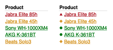
As you’re designing, make sure your component does not use color alone to signify a state change or communicate meaning, such as a status. For example, a table containing links to items with an associated status should not merely color the link text. One solution would be to add icons alongside the link text.
As you’re building, try to imagine how the document structure flows from one element to another. Do headings come before their associated content? If a control affects another part of the page, does that control come before whatever it affects? Does the visual order match the DOM order? As an extra step, turn off styles in your browser and check that your component still makes sense.
If an element of your component is clickable, then users should be able to tab to it and activate it with the keyboard as well. The tab order is closely related to document flow and is very important. It can be checked with tools like Firefox’s Accessibility Inspector. Tab and focus management can be nuanced for complex components, and the WAI-ARIA Authoring Practices can be a particularly helpful reference for knowing how something should function to match most user’s expectations.
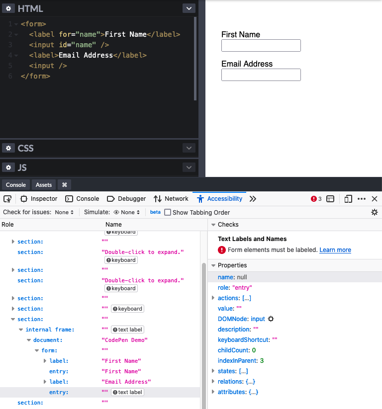
You can use browser dev tools (Firefox, Chrome) to check the accessible name of the elements in your component. Before pulling up a tool, though, look at your component and try to identify all of the information that is conveyed visually. Then make sure that that information is also conveyed non-visually (for example, that an image displaying an icon has an alt attribute describing that icon’s meaning).
Using in-browser commands, zoom your component in to 200% and out to 50%. Is it still usable? This will usually surface aspects of your component with fixed dimensions, which should generally be avoided.
If you’ve used non-relative units in your styles (like px), then you’ll need to also confirm that changing the browser’s zoom level in preferences doesn’t adversely affect your component.
As you’re building, and especially once you have a usable version of your component, there are many tools available to audit your work for accessibility issues and suggest fixes. One of the most popular is axe, which is available as a browser extension and built into Chrome dev tools and Lighthouse.
If you’re building your component in Storybook, axe is built into the a11y addon, to provide automatic audits as you work. You can also often integrate these audits into your continuous integration (CI) pipeline (for example, lighthouse-ci), preventing components from releasing with known accessibility problems.
Other tools you can use are assistive technologies (AT) themselves, such as screen readers like VoiceOver for Mac or NVDA for Windows. While there’s certainly a learning curve to using these tools, they will surface issues that cannot be found with automated checks and will help you empathize with how users of AT will understand and interact with your component.
There is no substitute for testing the actual component, in an actual product, with real people, with a variety of capabilities and impairments. User testing will help you discover aspects of your component not covered by the above steps or not even considered in your design. As designers and developers, it can be difficult to think of our work in the way that our users experience it. User testing can help break down these barriers to understanding. By using the above steps to make your component as accessible as you can before testing, you enable those testers to provide valuable feedback that might otherwise be lost in the noise of other issues.